Rol:
UX UI
Tools:
Figma | Whimsical
Skills:
Analisis Heuristico
Challenge:
Create a more intuitive and efficient user experience for our client’s website by identifying and resolving usability issues through heuristic analysis.
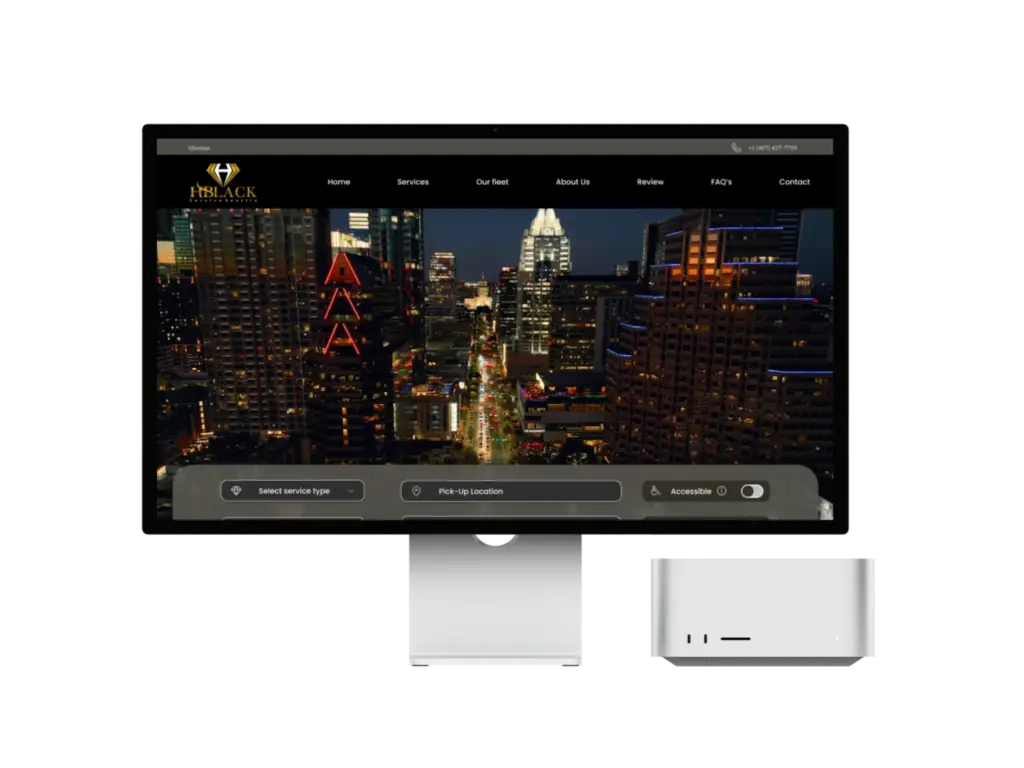
Solution: The redesign focused on improving navigability, accessibility and clarity of content, aligning the website with usability best practices to ensure a more user-friendly and functional experience for users. With this approach, we made the site more accessible and attractive, optimising every key aspect of the interface and user flow.
Redesign Process: Heuristic Analysis To ensure that every design decision was backed by sound usability principles, we conducted a heuristic analysis based on the Nielsen 10 heuristics, evaluating each element of the website and identifying areas for improvement. This process allowed us to focus efforts on specific aspects that impacted usability and, therefore, user satisfaction.


The strategy employed in this project involved the use of heuristic evaluation, a method of usability testing without user intervention, carried out by specialists. This technique consists of analysing the components of an interface according to a set of principles called heuristics. The heuristic foundations originate from the work ‘Heuristic evaluation of user interfaces’ by Jakob Nielsen and Rolf Molich (1990). Although other researchers have also proposed heuristics applicable to the web, Nielsen’s 10 principles are the most widely recognised and used, and these are the ones we will focus on.
1. Identifying Usability Issues: We began with a thorough review of the existing site, using heuristic analysis to assess aspects such as visibility of system state, user control and freedom, consistency, recognition rather than recall, and error prevention. This allowed us to generate a detailed list of areas for improvement.
2. Definition of Improvement Strategies:
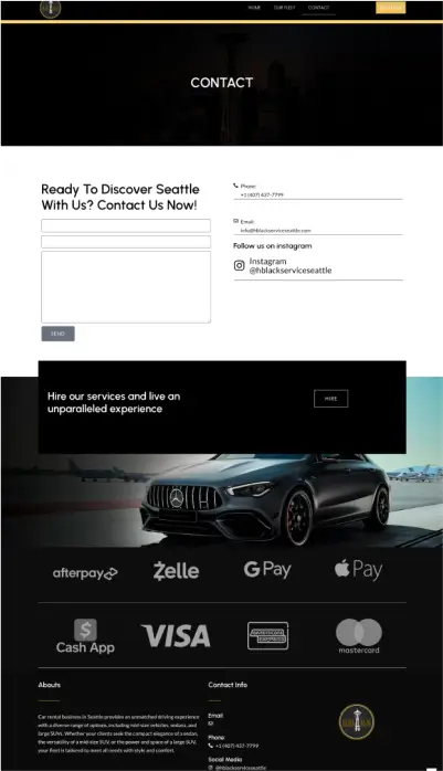
Navigability and Structure: We simplified the navigation structure to facilitate access to the main sections and reduce the number of clicks needed to reach key information. We improved the visibility of important elements and added clear indicators of the user’s status within the site.
Consistency and Aesthetics: We realigned the visual identity to ensure consistency in design, with a clean and cohesive style that reflects professionalism and clarity. In addition, we standardised interaction elements to make them predictable and easy to understand.
Feedback and Error Messages: We implemented clear, contextualised feedback messages and descriptive error messages to guide users and minimise frustration in case of incorrect actions.
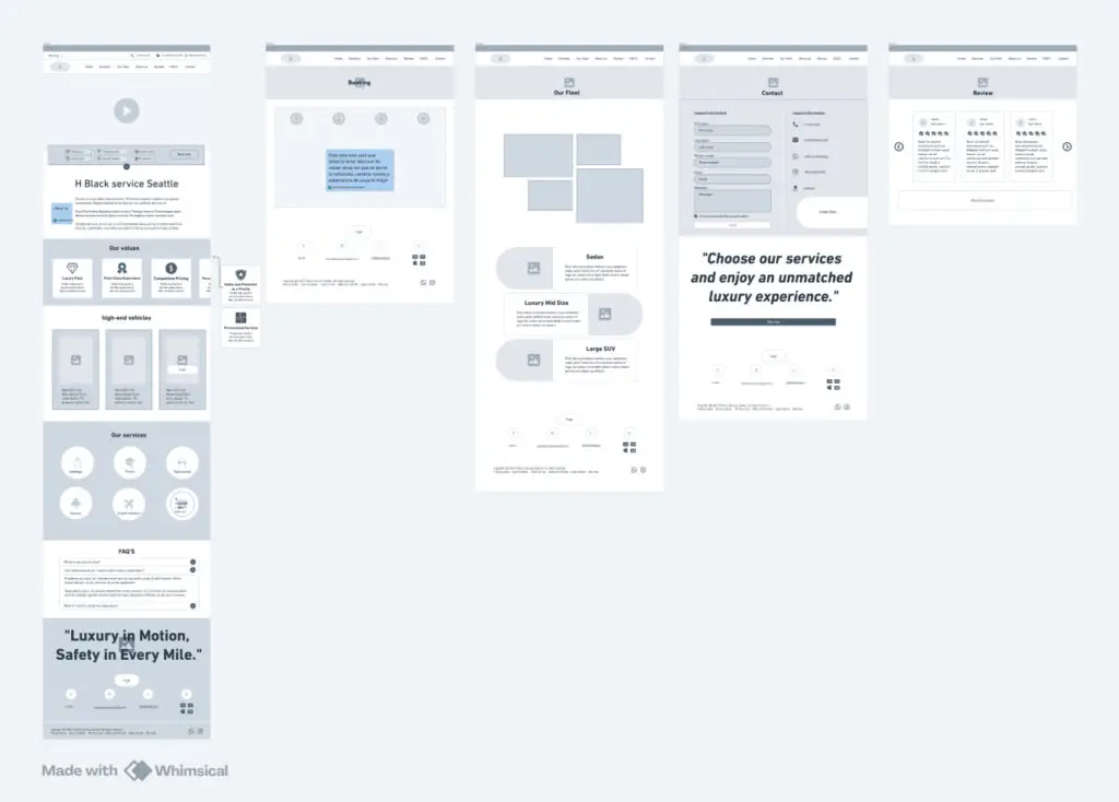
3. Prototyping and Testing: We created high-fidelity prototypes that incorporated the improvements based on the heuristic analysis and performed usability testing with real users. This testing allowed us to validate the effectiveness of the changes and make additional adjustments to optimise the user experience.
Impact and Learning This redesign demonstrated the value of an analytical and heuristic-based approach to effectively detect and solve usability problems. The heuristic analysis enabled the creation of a more accessible, consistent and satisfying user experience, aligning customer needs with an optimised, user-centric design.

