Rol:
UX UI
Tools:
Figma | Whimsical
Skills:
Heuristic Analysis
Challenge:
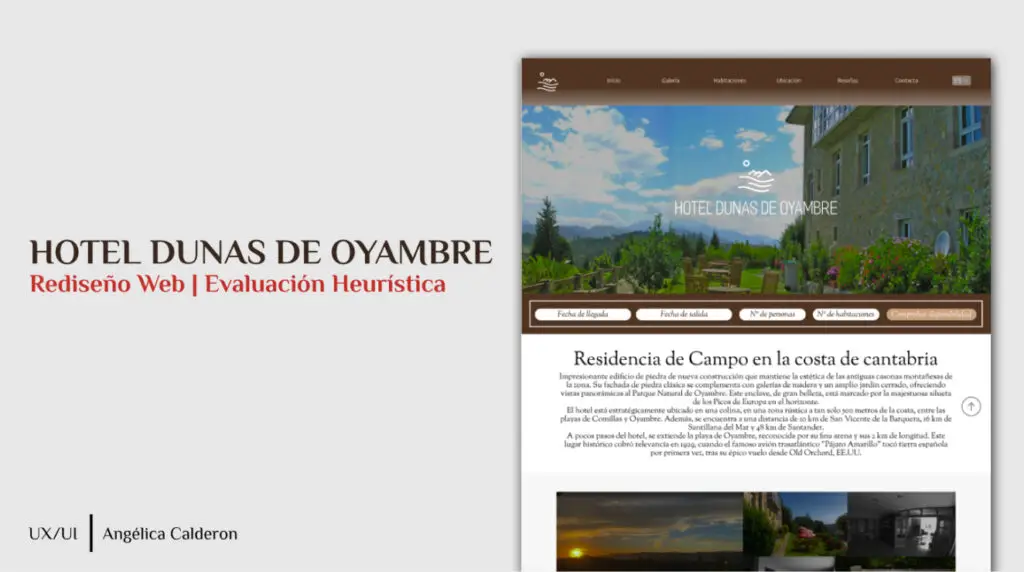
Redesign the website of Dunas de Oyambre, a hotel located in a unique natural environment, to improve usability, navigability and accessibility, providing a digital experience in line with the quality of the service offered by the hotel.
Solution:
This web redesign aimed to create an intuitive and engaging user experience that would allow users to easily explore the charm of Dunas de Oyambre, make uncomplicated bookings and find the information they need. Based on a heuristic analysis, we identified critical areas for improvement and proposed solutions that prioritised simplicity and efficiency in every user interaction with the website.
Redesign Process:
Heuristic Evaluation
To guide the redesign, we conducted a heuristic evaluation following Jakob Nielsen’s 10 usability heuristics, focusing on improving visibility of system state, consistency, accessibility and efficiency of interactions.
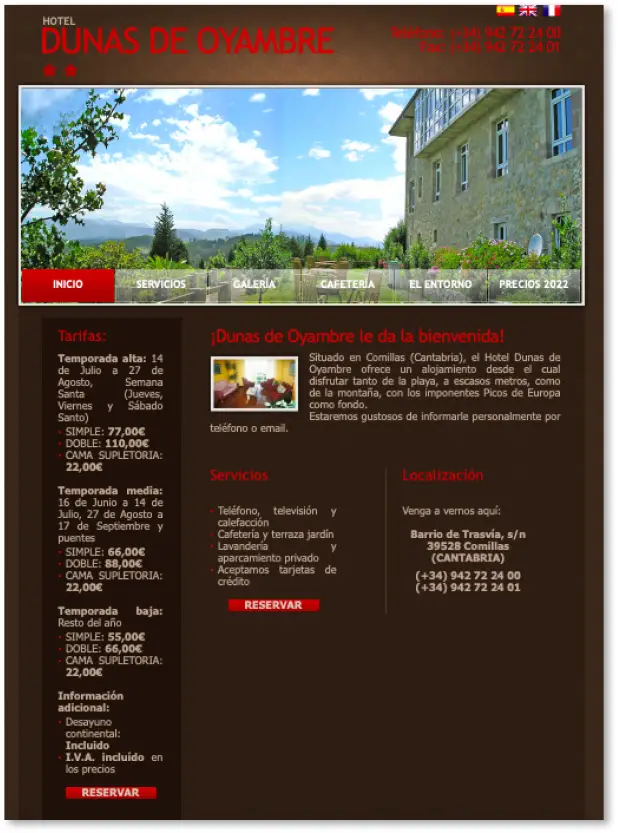
1. Identification of Usability Issues: The initial heuristic review revealed weaknesses in the navigation structure, clarity of information, visual loading and accessibility of the website. We noted, for example, that the booking system was not clear and that navigation on mobile devices required improvement.
2. Implementation of Heuristic Based Improvements:
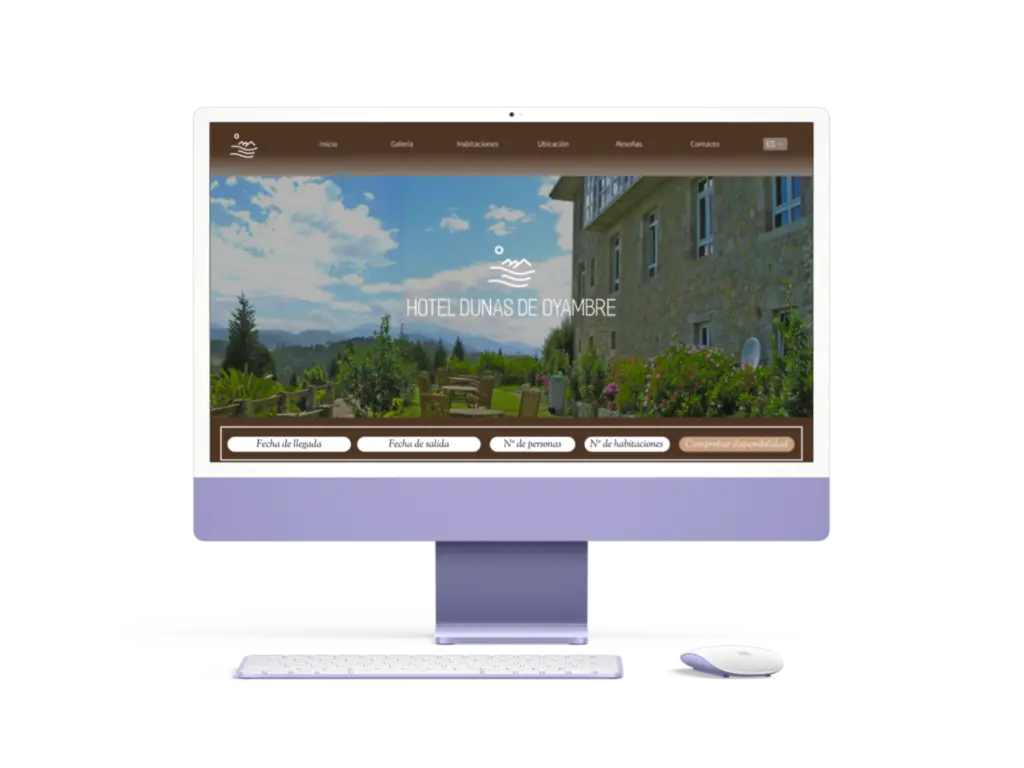
Simplified Navigation: We redesigned the navigation structure to be clear and straightforward, organising the main sections (rooms, services, location, reservations, contact) in a way that is accessible from any device.
Optimised Booking System: We integrated a more intuitive booking system, with clear steps and visible confirmation messages that provide immediate feedback to the user, aligned with system status visibility heuristics.
Visual and Aesthetic Consistency: We adjusted the visual identity of the site to reflect the welcoming and natural feel of the hotel, using a consistent colour palette and typography. In addition, we standardised buttons and icons so that elements were easily recognisable throughout the site.
Accessibility and Mobile Compatibility: We made adjustments to ensure the site was fully responsive and accessible, including descriptive labels and alternative text for visually impaired users. Accessibility testing helped ensure an inclusive experience for all users.
3. Prototyping and Validation: With the improvements implemented, we developed interactive prototypes that allowed usability testing. Users highlighted the ease of navigating the site and making bookings, confirming the positive impact of the redesign.

Assess the problems:
To evaluate the problems identified, I have applied a rating scale from 0 to 4, based on Jakob Nielsen’s criteria:
0: Indicates that the problem does not violate any heuristics, but does not reach a significant level of impact on usability.
1: Suggests that the problem could be addressed if there is additional time in the project, but is not crucial at this time.
2: Indicates a minor usability problem that can be corrected with a low priority in the project.
3: Denotes a significant usability problem that requires urgent attention and a high priority in the project.
4: Denotes a critical usability issue that must be addressed immediately before the product can be released, as it prevents the product from functioning properly.
This assessment allows us to prioritise and allocate resources effectively to resolve identified usability issues.
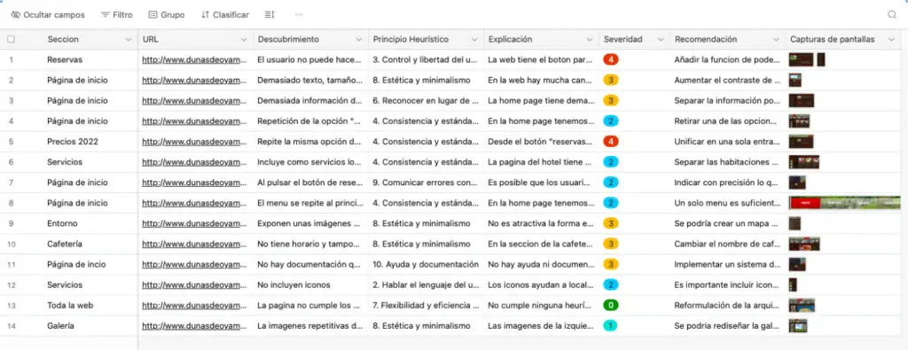
A table has been used to systematically organise the data related to the usability problems identified on the website. The table consists of 9 columns describing each problem as follows:
1. Location on the website: Indicates where the problem is located in the page interface.
2. URL: Link to the web page where the problem is located.
3. Discovery: Brief identification of the problem.
4. Explanation: Detailed description of the problem and its impact.
5. Heuristic principle: Indicate which usability heuristic principle is affected by the problem.
6. Severity: Assessment of the problem on a scale from 1 to 4, according to its severity.
7. Recommendation: Proposed solution to address the problem.
8. Screenshot: An image of the problem is included for better understanding.
This structure provides a clear framework for analysing, evaluating and addressing usability problems in an organised and efficient way.

Impact & Learning: The redesign of the Dunas de Oyambre website, based on a heuristic evaluation, not only improved the usability and accessibility of the site, but also contributed to a user experience that reflects the quality and charm of the hotel. This experience reaffirmed the value of a well-structured heuristic analysis to develop user-centred design solutions, creating an interface that is both intuitive and attractive.
